7 Content Repurposing Workflow Diagram Templates (2026)
Download 7 content repurposing workflow diagram templates. Systemise your process, delegate work, and turn 1 webinar into 47+ content pieces.

Webinars generate strong B2B demand, yet many teams still handle post-event repurposing as ad hoc production work instead of a defined operating system.
That is usually where output drops. The recording exists. The transcript exists. A few clips get published. Then momentum stalls because no one has mapped ownership, handoffs, review points, or distribution rules. The next webinar starts, and the team rebuilds the process again.
A documented content repurposing workflow diagram template fixes that. It gives your team a repeatable path from raw recording to channel-ready assets. Delegation gets easier. Bottlenecks become visible. Measurement is possible, which helps you connect repurposed content to pipeline, not just impressions.
The point is not to collect seven diagram styles for a slide deck. The point is to operationalise repurposing so production runs the same way every time, even when volume increases.
That is where automation changes the economics.
RepurposeYourContent removes several of the slowest manual steps by turning one webinar into usable draft assets, clips, and outputs without forcing your team to start from a blank page after every event. Instead of treating repurposing as extra work, you can run it as a system with inputs, checkpoints, and predictable throughput.
These seven templates are built for content marketing managers running webinars, podcasts, and keynote content across multiple channels. They all cover the same core job. Capture the source. extract the signal. adapt by format. review for quality. distribute on schedule. What changes is how the work is organised, who owns each stage, and how much of it you automate.
For broader planning ideas, pair this with 10 actionable content repurposing strategies.
1. Linear Sequential Workflow Diagram
If the team has no formal process, a linear diagram is the right starting point. It removes ambiguity fast.
This format works because it mirrors a common thought process. One source asset comes in. It moves through a clear set of stages. Nothing fancy. No hidden dependencies. No extra swim lanes.

A practical sequence looks like this:
- Source content: Webinar recording, keynote session, or podcast episode enters the workflow.
- Extraction: Transcript, key themes, proof points, quotes, and clips get pulled out.
- Format creation: Team turns those extracted parts into clips, blog drafts, posts, emails, and visuals.
- Branding: Brand kit, tone, naming, and visual standards get applied.
- Quality check: Editor or content lead reviews claims, wording, and channel fit.
- Publication: Assets move into the scheduler, CMS, CRM, or sales enablement system.
Best use case
This is the best content repurposing workflow diagram template for smaller in-house teams and new managers building process discipline.
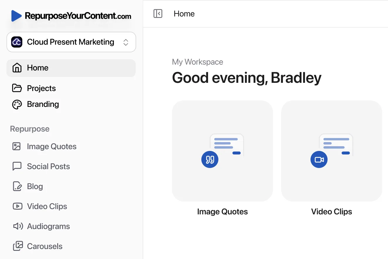
It also maps closely to RepurposeYourContent's production flow. Upload. Select formats. Choose quantities. Generate. Download. That matters because documented systems work best when the diagram matches the tool.
Practical rule: If a new team member can't follow the diagram without a meeting, the workflow is still too vague.
A webinar team can run this as a simple handoff chain. Events manager uploads the recording. Content manager reviews extracted themes. Designer checks visual outputs. Social lead schedules channel-specific posts. Demand gen manager tags campaign attribution before publishing.
What works and what doesn't
What works is clarity. A linear diagram forces a start point and an endpoint. It also makes it obvious where work stalls. Usually that's at review or formatting.
What doesn't work is overloading the diagram with every exception. If the team adds ten approval branches, the diagram stops being useful. Keep the default path clean. Handle exceptions in notes, not in the core visual.
This format also helps teams moving away from ad-hoc repurposing into a more systematic cadence. That's especially useful before adopting more advanced planning models like a content repurposing workflow for small teams.
2. Hub-and-Spoke Content Distribution Diagram
A linear flow shows process. A hub-and-spoke diagram shows output potential.
This one puts the source asset in the centre. Around it sit all the derivative formats. It works well when the main problem isn't production confusion. It's underestimating how much one strong recording can produce.
For webinar-led B2B teams, that central hub is usually the recorded session. From there, spokes branch into video clips, blog posts, social posts, audiograms, newsletters, LinkedIn carousels, image quotes, and timestamp-based highlights.
Why this format changes planning
A hub-and-spoke visual reframes the asset. The webinar stops being "the thing that already happened." It becomes the raw material for the next month of publishing.
That mindset matters because UK teams using AI-enhanced repurposing workflows have reported strong satisfaction with platform-specific optimisation, especially when transforming webinars into SEO blogs and LinkedIn threads, according to Averi's content repurposing template research.
A content marketing manager can use this diagram in stakeholder meetings. One circle in the middle. Eight spokes around it. Each spoke tied to a channel owner. That visual makes repurposing budget discussions easier because everyone can see what one event can feed.
Where it works best
This diagram suits teams with one strong recurring source format. Monthly webinars. Executive keynotes. Founder podcasts. Customer roundtables.
It also suits agencies. A client often understands "one source, many outputs" faster than they understand a process chart.
- Use the centre for the source asset: Add title, audience, campaign tag, and publication date.
- Use spokes for formats: Assign each spoke to a distribution channel, not just a file type.
- Add an outer ring for measurement: Track assisted opportunities, engagement, clicks, or nurture usage.
One source asset should feed multiple channels by default. If it doesn't, the team either chose the wrong source or extracted too little from it.
The trade-off is obvious. This diagram is great for content planning, but weak for operational detail. It won't show bottlenecks well. It won't clarify review order. Use it for strategy, not task management.
3. Swim Lane Workflow Diagram
Once several people touch the workflow, a single flowchart stops being enough. The issue isn't the steps. It's the handoffs.
A swim lane diagram fixes that by showing who owns what. That's where many teams finally see the true problem. The workflow isn't broken at extraction. It's broken between extraction and approval.

A strong setup usually has lanes for:
- Content operations: Owns intake, naming, tagging, and workflow kickoff.
- AI processing: Handles transcription, extraction, first-pass formatting, and asset generation.
- Editorial: Reviews claims, voice, structure, and audience fit.
- Design and brand: Checks visual consistency for carousels, image quotes, and thumbnails.
- Distribution and analytics: Publishes assets and tracks channel performance.
A practical handoff model
Step 1. Webinar manager drops the recording into the intake queue.
Step 2. RepurposeYourContent processes the recording and generates clips, blog drafts, social posts, audiograms, carousels, newsletters, and timestamps.
Step 3. Editorial reviews written outputs while design checks image-based assets in parallel.
Step 4. Social and lifecycle teams publish approved assets into their own channels.
Step 5. Demand gen or ops tags source-to-output attribution.
Automation is most critical. Structured templates have grown sharply among UK mid-sized B2B teams, and London-based demand gen teams using these templates report notable time savings in webinar-to-multi-format pipelines, according to Libril's content repurposing guide.
What this reveals fast
Swim lanes expose delays no one sees in a simple list. Brand review waits on copy. Social waits on design. Analytics never gets the final UTM data. The team blames production speed, but the actual issue is unclear ownership.
A good swim lane diagram should show parallel work. Written assets don't need to wait for image quote approval. Audiograms don't need to wait for blog formatting.
A short walkthrough helps teams visualise it in motion:
Watch for this: If one person appears in three lanes, the workflow is under-resourced or badly designed.
The downside is complexity. This template can overwhelm smaller teams. If two people do all the work, a swim lane often creates false precision. In that case, the linear model is cleaner.
4. Agile Sprint-Based Repurposing Workflow
Teams that repurpose consistently publish more useful assets from the same source content. The difference is rarely creativity. It is operating cadence.
An agile sprint workflow turns repurposing into a repeatable production system. You stop treating each webinar, podcast, or keynote as a one-off cleanup job. Instead, each source enters a backlog, the team commits to a defined batch of outputs, and production runs against a short deadline.
That structure matters because manual repurposing work expands fast. Clip selection, transcript cleanup, copy drafting, asset resizing, approval routing, and scheduling can easily consume the sprint before distribution even starts. RepurposeYourContent changes the economics of this model. It automates the slowest conversion steps, so the sprint can focus on channel fit, review, and performance rather than file handling.
A practical sprint structure
A working sprint usually has four parts:
- Backlog and planning: Pick source content with clear campaign value. Decide the output mix before production starts.
- Production sprint: Extract clips, transcripts, quotes, emails, and post drafts from each source asset.
- Publishing window: Assign final edits, approvals, and scheduling by channel.
- Retrospective: Review output volume, publishing speed, and where manual work still slowed the team down.
The planning decision is where good teams save time. A webinar often produces clips, recap emails, and short LinkedIn posts. A podcast episode usually gives you stronger quote graphics, audiograms, and founder-led commentary. A keynote can support executive content, event follow-up, and newsletter sections better than bottom-of-funnel nurture assets.
One rule helps more than any template. Lock the asset mix before the sprint starts.
Teams that skip that step end up choosing formats halfway through production. That creates rework. Writers draft posts nobody needs. Designers build assets for channels with no scheduled slot. Reviewers get pulled into approvals that should never have entered the sprint.
Where sprint workflows actually break
The common failure point is not planning discipline alone. It is capacity mismatch.
A two-week sprint looks clean on a whiteboard, but it falls apart if one marketer is still copying transcript excerpts into docs, clipping video by hand, and rewriting every post from scratch. The workflow says "agile." The actual process is still manual.
That is why this template works best when automation sits inside the sprint, not outside it. RepurposeYourContent helps teams compress source processing into a faster, more predictable step. Instead of spending days turning a webinar recording into usable raw assets, the team can move straight into editorial review and channel adaptation. That makes sprint planning more accurate because output volume is no longer based on guesswork.
A simple two-week cycle might look like this:
- Source 1: One webinar for demand capture
- Source 2: One podcast for category opinion
- Source 3: One keynote or panel for executive brand content
That gives the team a fixed production rhythm and cleaner attribution. Each asset belongs to a sprint, each sprint has a defined output target, and each retrospective shows where the system needs work.
The trade-off is rigidity. Sprint models suit teams with enough volume to justify process discipline. Smaller teams with irregular source content may find this too structured. But if you are producing recurring webinars or episodes, a sprint-based repurposing workflow is one of the clearest ways to operationalise output and remove the slow manual steps that keep content stuck in draft.
5. Quality Gate Checkpoint Diagram
Content volume is rarely the actual failure point. Approval friction is.
A quality gate checkpoint diagram gives your team a clear pass or fail standard at each stage of repurposing. That matters when one webinar turns into a blog post, six social clips, a sales follow-up email, and a customer newsletter. If nobody owns review criteria, weak assets slip through or strong assets stall in draft.
This model works well for regulated teams, brand-sensitive companies, and any operation using AI to speed up production. The goal is simple. Define what gets checked, who checks it, and what happens when an asset fails.

A practical set of gates
A workable sequence looks like this:
- Gate one: Transcript and extraction check
- Gate two: Brand and tone review
- Gate three: SEO and platform formatting
- Gate four: Fact and compliance review
- Gate five: Final approval and scheduling
Gate four often gets missed in generic templates. It should not. If webinar recordings include customers, prospects, partners, or internal subject matter experts, review rules need to cover permissions, sensitive claims, and privacy handling before the content reaches distribution.
This is also where a full repurposing system beats a loose collection of diagrams. RepurposeYourContent can reduce the manual work at the front of the process by turning long-form recordings into usable draft assets faster. That lets reviewers spend time on judgment calls, not file prep, transcript cleanup, or clip hunting. The diagram stays the same. The bottleneck moves.
Where to be strict and where to be light
Every asset does not need the same review path.
A flagship article, product page excerpt, or compliance-adjacent email should pass through every gate. A short social clip or image quote may only need brand, factual, and scheduling checks. Good checkpoint diagrams show both paths. One for high-risk assets. One for low-risk assets.
That split protects output. It also protects review capacity.
Teams should also log why assets fail. Repeated quality issues usually point to an upstream process problem. If clips keep failing because the source segments are weak, fix extraction rules. If blog drafts keep getting rejected for sounding generic, improve the brief or prompt before the content reaches editorial review.
The trade-off is speed versus control. More gates reduce publishing risk, but they can also slow campaign timing and create approval queues. Fewer gates increase throughput, but errors become more likely. The right diagram makes that trade-off visible, then sets review depth by asset risk instead of forcing every format through the same path.
6. Channel-First Workflow Diagram
Teams that start with the target channel usually measure repurposing better than teams that start with the source file. The reason is simple. The workflow already knows what success looks like before anyone clips, edits, or writes.
A channel-first diagram works backwards from distribution. It starts with the job each channel needs to do, then defines the assets, edits, and approvals required to support that job. You stop asking, "What can we make from this webinar?" You ask, "What does LinkedIn need this week, what does email need this month, and what should search capture over time?"
That shift changes production fast.
If LinkedIn is the priority, pull opinion-led clips, image quotes, and carousel frameworks. If email nurture is the priority, extract objections, proof points, and CTA-ready teaching segments. If organic search is the priority, select transcript sections with enough depth to become structured articles, FAQ blocks, and timestamp-led long-tail pages.
Why this model improves attribution
Channel-first workflows reduce random output and make reporting cleaner.
Many B2B teams still fail to connect repurposed assets to pipeline outcomes, and many workflow diagrams never show where that handoff happens, as noted in Cognism's discussion of content repurposing gaps. Start with channel purpose and the measurement point gets built into the workflow instead of bolted on later.
A practical diagram usually includes four fields:
- Channel objective: Awareness, nurture, demand capture, sales enablement
- Audience segment: Cold audience, engaged lead, open opportunity, customer
- Best-fit formats: Clip, carousel, blog, newsletter, audiogram, quote card
- Measurement point: Engagement, click, reply, meeting assist, influenced opportunity
This is also one of the clearest places to operationalise repurposing as a system, not a content brainstorm. RepurposeYourContent shortens the manual middle of the process by turning long-form recordings into draft assets tied to channel outputs. That removes a lot of clip hunting, transcript cleaning, and format prep. Your team can spend more time choosing the right destination and less time manufacturing first versions.
Best use case and main risk
Channel-first workflows suit mixed source content. Webinars, podcasts, interviews, and keynote recordings rarely deserve the same output mix.
A podcast episode might feed email and social better than search. A keynote often produces stronger carousels and executive posts than nurture assets. A product webinar usually has more value for blog content, short clips, and sales follow-up than a general brand video.
The trade-off is real. A channel-first setup can push teams toward immediate demand from each platform and away from building reusable asset libraries. Fix that in the diagram. Add a shared repository for transcripts, approved claims, clips, quotes, and messaging blocks so every channel-specific workflow still contributes to a reusable content bank.
Operational note: If your team cannot explain the channel job of a format, remove it from the workflow.
7. Batch Processing and Content Calendar Integration Diagram
This is the template for teams that need output consistency, not isolated wins.
A batch-processing diagram shows multiple source assets moving through one repurposing engine and then landing on a shared calendar. It connects production to publishing. That's what many diagrams miss.
The value is simple. Teams stop asking, "What can this webinar become?" They start asking, "What does next month's calendar need, and which source assets should feed it?"
The most practical setup
Batch diagrams work best when grouped by theme, campaign, or audience stage.
A sensible structure looks like this:
- Batch source assets by month or campaign
- Process each asset through the same five stages
- Assign output types before generation
- Push approved assets into a calendar view by channel and date
- Review performance and feed the findings back into the next batch
This is also where documentation beats ad-hoc work most clearly. UK studies referenced in the verified material show stronger cadence consistency and publishing growth among teams using structured processes, rather than treating repurposing as isolated manual tasks. The pattern is clear even without repeating every benchmark. Systematic teams publish more predictably.
How RepurposeYourContent helps
RepurposeYourContent is especially useful in this model because it collapses the middle of the workflow. Instead of manually transcribing, extracting, and adapting each webinar in separate tools, the platform handles those stages in one step.
That means a batch calendar can include:
- video clips for LinkedIn and YouTube
- blog posts for search and resource centres
- social posts for ongoing distribution
- audiograms for audio-first promotion
- image quotes for fast social coverage
- newsletters for nurture
- LinkedIn carousels for thought leadership
- timestamps for internal reuse and sales follow-up
The trade-off is review load. Batch processing creates efficiency, but it can create content review spikes if approvals aren't staggered. The diagram should show publishing waves, not one giant approval pile.
Comparison of 7 Content Repurposing Workflow Diagrams
| Workflow Diagram | Core approach | Best for / Team size | Value proposition | Quality & control | Trade-offs / Limitations |
|---|---|---|---|---|---|
| Linear Sequential Workflow Diagram | Step-by-step flow (Upload → Extract → Create → Brand → QA → Publish) | Teams new to repurposing; 5–50 people | Easy to learn; mirrors RepurposeYourContent 5‑step; fast adoption | Built-in QA checkpoints; clear handoffs | Can feel rigid; oversimplifies iterations; weak dependency view |
| Hub-and-Spoke Content Distribution Diagram | Central webinar hub with 8+ spokes to channels/formats | Multi-channel teams & exec presentations; 3–100+ | Shows 1→many ROI; highlights parallel outputs and channel mapping | Brand kit at center; QA less explicit (needs add‑ons) | Can look cluttered; no sequence or QA detail |
| Swim Lane Workflow Diagram (Cross-Functional) | Horizontal lanes by function showing handoffs and timing | Agencies & large marketing teams; 15–100+ | Clarifies ownership, reduces confusion, exposes bottlenecks | Strong visibility on approvals and manual vs. automated work | Complex to design; overwhelming for small teams; needs upkeep |
| Agile Sprint-Based Repurposing Workflow | Cyclical 1–2 week sprints with planning, execution, review | Agile teams batching webinars; 5–40 people | Predictable cadence, continuous improvement, measurable velocity | Regular reviews & retrospectives improve quality | Requires Agile buy‑in; overhead for small teams; less reactive |
| Quality Gate Checkpoint Diagram | Multiple validation gates (AI review → Brand → SEO → Fact → Final) | Enterprise & regulated teams; 10–100+ | High brand/compliance protection; audit trails; fewer reworks | Very high, SLAs, checklists, traffic‑light approvals | Adds time per piece; needs dedicated editors; possible bottlenecks |
| Channel-First Workflow Diagram | Start with channel goals & audience, then choose formats | Data-driven demand-gen teams; 8–100+ | Maximizes ROI by channel, audience-fit content, A/B testing | Performance data drives QA and format tweaks per channel | Needs historical data; complex planning; ongoing monitoring |
| Batch Processing & Content Calendar Integration Diagram | Process webinars in batches and map outputs to master calendar | High-volume teams & campaign-aligned ops; 8–50+ | Economies of scale, predictable calendar, campaign alignment | Calendar enforces timing; resource planning reduces conflicts | Less flexible for urgent needs; needs steady webinar cadence |
Automate Your Workflow. Instantly.
Teams with a documented workflow still miss deadlines if the manual production steps sit between the recording and the publish queue.
That is usually where repurposing breaks. The recording exists. The intent is there. Then the work spreads across transcription tools, notes docs, clip selection, copy rewrites, design requests, and approval threads. Output slows down, quality drifts, and the webinar that should have produced a month of content turns into one LinkedIn post.
A content repurposing workflow diagram template solves the planning problem. It shows the stages, owners, handoffs, and checkpoints. It also makes bottlenecks visible before they disrupt production.
Execution is the harder part.
The biggest operational gain comes from reducing the manual work in the middle of the process. Transcribe. Extract. Adapt. Those steps take the most time, and they create the most variation when different team members handle them in different ways. If you want a workflow that runs every week, not just when the team has spare capacity, those steps need system support.
RepurposeYourContent handles that compression well. You upload one webinar, choose the formats and quantities you need, generate the assets, and download outputs that are ready for review or publishing. Instead of moving a recording through separate tools and repeated manual rewrites, the platform produces video clips, blog posts, social posts, audiograms, image quotes, newsletters, LinkedIn carousels, podcasts, and timestamps inside one operating flow.
This is significant because UK B2B teams are already shifting toward more structured, AI-assisted production, as noted earlier. The practical takeaway is simple. Document the workflow. Make it measurable. Then remove as much repetitive manual effort as possible.
A workable five-stage model still gives teams the clearest baseline:
- Capture: Collect the webinar, podcast, or keynote recording.
- Transcribe: Turn the recording into searchable text and timestamps.
- Extract: Pull out hooks, clips, quotes, objections, themes, and useful frameworks.
- Adapt: Convert those assets into channel-specific formats.
- Distribute: Publish, measure performance, and feed the results back into the next cycle.
RepurposeYourContent compresses the middle of that chain into one automated step. That turns a diagram from a planning asset into an operating system.
Build the workflow once. Run it every time.
Try RepurposeYourContent and turn the next webinar into 30 days of content.
Tags: