Content Marketing ROI Measurement: Prove Your Value
Learn a step-by-step framework for content marketing ROI measurement. Prove your value, calculate costs, attribute revenue, and multiply returns.

For many, the issue isn’t a content problem. It’s a proof problem.
In the UK, content marketing delivers an average ROI of 3:1 for B2B organisations, yet many teams still can’t defend budget because they miss staff time in costs or credit the wrong assets in revenue attribution, as noted in these UK ROI benchmarks. That’s why content marketing ROI measurement breaks down in the boardroom. The work may be good. The model is weak.
Executives don’t want a slide full of page views. They want a model that shows cost, influence, pipeline, and payback. They want to know what content contributed, how long it took to contribute, and whether the same budget should be spent again next quarter.
That requires more than a dashboard. It requires a method.
Your Starting Point Define Business Goals Not Vanity Metrics
The fastest way to lose credibility is to lead with activity metrics.
Page views matter. Clicks matter. Webinar registrations matter. None of them answer the question a finance lead will ask first. What commercial result did this create?

What executives actually care about
A defensible model starts with business goals, then works backwards into content KPIs.
Use three layers:
- Financial outcomes: Revenue influenced, pipeline created, pipeline influenced, customer acquisition cost, and customer lifetime value.
- Commercial progress: Qualified leads, sales conversations, opportunities created, and deal progression.
- Content signals: Organic traffic, engaged visits, webinar attendance, downloads, email clicks, and return visits.
The mistake is treating the third layer as the headline. It isn’t. It’s supporting evidence.
Practical rule: If a metric can’t connect to pipeline or revenue later, it doesn’t belong in the executive summary.
Leading indicators and lagging indicators
Good content marketing ROI measurement uses both. Leading indicators tell a team whether content is moving in the right direction before revenue lands. Lagging indicators show whether that movement turned into money.
A simple way to sort them:
| Metric type | What it tells you | Example use |
|---|---|---|
| Leading indicator | Early signal of traction | Organic traffic to a webinar-derived blog post |
| Mid-funnel indicator | Buyer movement | Clicks from a clip to a gated asset |
| Lagging indicator | Commercial impact | Pipeline and closed revenue tied to content touchpoints |
This is why webinar content needs a tighter measurement framework than generic blog reporting. One webinar can influence awareness, consideration, and decision over a long period. A clip may create first contact. A blog post may nurture. A newsletter mention may trigger a demo request weeks later.
Teams that track only surface metrics miss that chain. Teams that map assets to business outcomes can defend spend.
Set KPIs by business objective
Use the objective first, then assign content metrics to it.
If the company wants more pipeline from existing demand, then awareness metrics are not enough. The content programme should be measured by opportunity creation and influence on active deals. If the company wants lower acquisition costs, compare content-sourced lead costs against other channels. If the company wants better sales efficiency, track whether content shortens evaluation and helps prospects progress.
A simple KPI stack works well:
- Awareness goal: Traffic quality and reach from educational content.
- Consideration goal: Engagement with deeper assets such as webinars, articles, and email sequences.
- Decision goal: Pipeline creation, pipeline influence, and closed-won revenue.
This is also where teams should define content-specific success criteria before publishing. A webinar clip should not be judged like a bottom-funnel page. A thought leadership post should not be judged like a pricing CTA. Different jobs require different scorecards.
For teams building webinar programmes, this guide to webinar metrics and KPIs to track is useful because it forces stage-based measurement instead of dumping everything into one campaign bucket.
What doesn’t work
Three habits usually break the model:
- Reporting volume without value: A team publishes a lot, but can’t show which assets moved buyers.
- Blending all content together: Webinar clips, articles, social posts, and newsletters get one average result. That hides winners and losers.
- Ignoring time lag: Content often compounds. Early reports can undervalue evergreen assets if the window is too short.
Content should be measured like a portfolio, not a pile.
Once goals are tied to business outcomes, attribution becomes much easier. Without that step, every ROI number is fragile.
How to Attribute Revenue with a Clear Attribution Model
Attribution is where content marketing ROI measurement becomes either credible or useless.
A common pitfall in ROI measurement is an obsession with vanity metrics. While 86% of UK marketers track pageviews, only 42% successfully link content to revenue. This leads to ROI miscalculations of 25-30% due to poor attribution and inconsistent data tagging, according to this analysis of ROI mistakes.
That gap matters because content rarely closes a deal in one touch. Buyers move through several interactions. If the model only gives credit to the final click, earlier content gets ignored. If it only gives credit to the first touch, conversion assets get undervalued.
A visual comparison helps before choosing a model.

First-touch attribution
First-touch assigns full credit to the first recorded interaction.
This model is useful when leadership wants to know which content starts buyer journeys. It’s especially helpful for awareness content such as educational blog posts, webinar clips, and social posts. It also works when tracking setup is basic and CRM integration is still immature.
Its weakness is obvious. It ignores everything that happened after discovery.
Use first-touch when the main question is: which content brings new buyers into the system?
Last-touch attribution
Last-touch gives full credit to the final interaction before conversion.
This is still common because it’s easy to explain. It can be useful for measuring decision-stage assets such as comparison pages, demo pages, or strong nurture emails. It also suits teams with short sales cycles and limited analytics maturity.
But it creates bad budget decisions when used alone. It usually overvalues closing assets and undervalues the content that educated and nurtured the buyer earlier.
Use last-touch when the main question is: which asset pushed the prospect over the line?
A lot of teams need a practical explanation before they clean this up. This video does that well.
Multi-touch attribution
Multi-touch spreads credit across the journey.
This is the strongest option for B2B teams with longer sales cycles, multiple stakeholders, and content used across the funnel. It reflects reality better than first-touch or last-touch because it accepts that several assets contributed.
Common variants include:
- Linear: Every recorded touch gets equal credit.
- Time-decay: Later interactions get more credit than earlier ones.
- U-shaped: More credit goes to first touch and conversion touch, with the rest shared across middle interactions.
A model doesn’t need to be perfect. It needs to be consistent, explainable, and hard to manipulate.
For many B2B teams, linear is the easiest place to start. It’s simple enough for leadership to understand and fairer than single-touch models.
Match content to funnel stage
Attribution only works if content assets are classified properly.
A clean stage model looks like this:
| Funnel stage | What to measure | Typical content |
|---|---|---|
| Awareness | Traffic and discovery | Social posts, short video clips, educational blog posts |
| Consideration | Engagement and lead capture | Webinars, newsletters, in-depth articles, carousels |
| Decision | Pipeline movement | Product-focused emails, solution pages, sales enablement content |
The point isn’t to force every asset into one stage forever. Some assets can do more than one job. The point is to assign a primary role so the reporting is coherent.
A simple attribution workflow
Many teams overcomplicate this. The operational version can stay lean.
- Tag every asset consistently. Include content type, campaign, topic, funnel stage, and date.
- Connect analytics to CRM records. Every known lead should carry source and touchpoint history.
- Choose one primary model. Use first-touch or last-touch as a comparison view, not the executive headline.
- Review paths, not only conversions. Look at which assets appear repeatedly before opportunities progress.
- Audit untagged traffic monthly. Missing tags create silent underreporting.
For teams running demand generation programmes from webinars, this demand generation content playbook is a useful reference because it shows how content types map to buying stages rather than sitting in one reporting bucket.
What works is boring discipline. Naming conventions. CRM hygiene. Shared definitions with sales. What doesn’t work is arguing over attribution philosophy while campaign links are still inconsistent.
Calculating Your True Costs and Financial Returns
A strong attribution model still won’t save a weak ROI calculation if the cost side is wrong.
Many organizations undercount investment. They include freelance fees and ad spend, then ignore internal labour, software, approvals, editing time, and distribution effort. That makes content look cheaper than it is. Finance will spot that quickly.

What goes into investment
The standard formula is [(Return - Investment) / Investment] x 100. The formula is simple. The discipline sits inside the inputs.
Include all direct and indirect costs tied to the asset or programme:
- People time: Strategist, writer, editor, designer, demand gen manager, webinar host, and operations support.
- Production spend: Video editing, design work, copywriting, transcription, and contractor fees.
- Software: CMS, analytics tools, SEO tools, webinar platform, scheduling tools, and workflow software.
- Distribution costs: Paid social support, email platform usage, syndication, and internal promotion time.
- Overhead allocation: A fair share of management and operational support if reporting at programme level.
If a team member spent time creating, approving, publishing, or promoting the asset, that time belongs in the cost base.
Cost per piece matters
Programme-level ROI is useful. Asset-level economics are where decisions improve.
Every team should calculate:
- Cost per asset
- Cost per lead
- Cost per opportunity influenced
- Cost per revenue-generating content type
Weak formats get exposed. A format that looks efficient in production may be poor at creating downstream commercial value. Another format may look expensive upfront but produce stronger assisted revenue over time.
A practical resource on how to measure content marketing ROI can help teams pressure-test whether they’re counting both cost and attributed return properly.
How to calculate return
Return should come from the attribution model already agreed with leadership. Don’t switch models to flatter the result.
The simplest approach is to pull attributed revenue or pipeline value from CRM records tied to tracked content interactions. If leadership prefers a more conservative model, report pipeline influenced first and closed-won revenue second. That keeps the number credible.
A basic reporting template works well:
| Content asset | Total cost | Attribution model | Commercial result | ROI status |
|---|---|---|---|---|
| Webinar | Full production and promotion cost | Multi-touch | Pipeline influenced and revenue attributed | Positive, neutral, or negative |
| Blog post | Production plus distribution cost | First-touch or multi-touch | Lead creation or assist value | Positive, neutral, or negative |
| Email sequence | Copy, setup, and send cost | Last-touch or multi-touch | Demo requests or opportunity progression | Positive, neutral, or negative |
Sample ROI calculation
Keep the maths plain.
If a content programme costs £10,000 and attributed revenue is £30,000, the ROI calculation is:
[(£30,000 - £10,000) / £10,000] x 100 = 200%
That means the programme returned the original investment plus double that amount in gain.
Use the same structure for a single webinar campaign, a quarterly blog programme, or a repurposed content cluster. The only thing that changes is the cost scope and the attribution window.
Time-to-value should be tracked separately
ROI alone doesn’t answer how fast content pays back.
A CFO will often ask two questions at once. Is this profitable, and how long until it becomes profitable? That’s why time-to-value should sit beside ROI in the dashboard.
Track the time between publication and these milestones:
- First qualified visit
- First lead capture
- First pipeline influence
- First attributed revenue
For agency teams or high-output internal teams, this guide on how agencies scale content production is useful because it highlights the operational side of cost control, which often affects ROI more than the creative itself.
What works is honest accounting. What doesn’t work is pretending internal time is free.
The Repurposing Multiplier A Practical ROI Case Study
Here, content economics change.
A single asset has linear output. One webinar can produce a whole content cluster. That changes cost per piece, time-to-value, and the number of measurable touchpoints feeding the attribution model.
Emerging UK benchmarks show that AI repurposing tools can cut content production time from days to minutes, producing 4.2x higher ROI for social clips and emails derived from webinars, while automatically branded repurposed content like LinkedIn carousels can lift engagement by 45%, according to these UK content tech benchmarks.
The practical workflow
A spreadsheet-ready model starts with one recorded webinar.
- Host one webinar. Capture a topic with clear buyer relevance and a strong transcript.
- Break it into multiple formats. Create short clips, blog posts, social posts, newsletter copy, audiograms, image quotes, and LinkedIn carousels.
- Track each format separately. Measure traffic, engagement, assisted conversions, and pipeline touchpoints by asset type.
- Roll results back to the source asset. Report both individual format performance and total webinar-derived return.
That’s the repurposing ROI model. One source asset. Many measurable outputs. Shared production base.
Manual creation versus AI repurposing
The commercial argument isn’t just speed. It’s unit economics.
If a team creates every asset manually, each piece carries its own planning, writing, editing, design, and approval burden. If the team repurposes from a webinar, those costs are spread across a larger output set.
Here’s a simple comparison framework.
| Metric | Manual Process | With RepurposeYourContent |
|---|---|---|
| Core source material | Separate brief for each asset | One webinar recording used as the source |
| Production workflow | Repeated writing, editing, design, approvals | Automated multi-format generation from one source |
| Time to initial output | Days across formats | Minutes across formats |
| Cost per piece | Higher because each asset is produced from scratch | Lower because source effort is shared across many assets |
| Tracking setup | Often fragmented by team or channel | Easier to organise by source webinar and derived format |
| Brand consistency | Manual checks across all pieces | Automatic brand application across outputs |
A team doesn’t need perfect attribution to see the benefit. If one production investment generates many assets, the cost base per asset falls. If more assets are published, the number of touchpoints rises. If touchpoints rise, the attribution model captures more influence across the funnel.
More formats don’t automatically mean more ROI. Better measured formats usually do.
Repurposing ROI in a spreadsheet
The cleanest way to show this to leadership is with two layers.
First, calculate the source asset economics:
- Total webinar production cost
- Promotion cost
- Repurposing cost
- Total number of usable derived assets
Then calculate the format economics:
- Cost per derived asset
- Traffic by asset
- Engagement by asset
- Leads and pipeline touchpoints by asset
- Attributed return by asset type
The key metric is the gap between creating one webinar plus many derivative assets, versus creating the same volume of content as separate projects. The second option usually carries duplicated planning and production effort. The first spreads one investment across a wider output base.
A sample ROI calculation for repurposed content
Use the same ROI formula, but add one more layer. Calculate cost per piece before calculating total return.
Example structure:
| Input | Sample value |
|---|---|
| Webinar production cost | £10,000 |
| Number of derived assets | 30+ pieces |
| Average cost per derived piece before distribution | Webinar cost divided by total derived pieces |
| Attributed revenue from the full asset cluster | £30,000 |
| ROI | [(£30,000 - £10,000) / £10,000] x 100 = 200% |
The value of repurposing is visible in two places. The first is total ROI. The second is the reduction in cost per asset compared with producing each piece separately.
That’s where the business case becomes hard to argue with. Leadership doesn’t need abstract talk about “doing more with content”. They can see one source asset generating a measurable portfolio.
For teams trying to operationalise this at scale, the content multiplication framework gives a useful way to think about source assets, derivative formats, and tracking.
What doesn’t work is posting the webinar replay and calling the job done. That leaves most of the commercial value locked inside a single long-form asset.
How RepurposeYourContent Makes ROI Tracking Easier
The hard part of content marketing ROI measurement isn’t only producing content. It’s producing content in a way that creates clean, trackable touchpoints.
A single webinar recording is difficult to measure well on its own. It may attract some views, some on-page engagement, and a few conversions. But it’s one large asset serving several jobs at once. Reporting gets muddy fast.
More formats create cleaner touchpoints
When one webinar is turned into multiple asset types, the model improves because each format has a clearer role.
- Video clips can be tracked for awareness and click-through to owned pages.
- Blog posts can be tracked for organic traffic, assisted conversions, and lead capture.
- Social posts can be tagged for first-touch discovery.
- Audiograms create another testable distribution format.
- Image quotes can support social engagement and referral traffic.
- Newsletters can be measured against click-through and influenced progression.
- LinkedIn carousels can support consideration-stage engagement.
- Timestamps make long-form webinar content easier to browse and analyse.
Instead of asking whether “the webinar worked”, a team can ask which outputs from the webinar worked, at which funnel stage, and under which attribution model.
Better structure improves reporting discipline
This matters operationally.
A team can assign a campaign ID to the webinar, then a format label to every derivative asset. That creates a simple hierarchy:
| Reporting level | Example |
|---|---|
| Source asset | Webinar campaign |
| Derived format | Blog post, clip, carousel, newsletter |
| Funnel role | Awareness, consideration, decision |
| Outcome | Traffic, engagement, pipeline influence |
That structure makes executive reporting cleaner because it shows both the parent investment and the child assets that created downstream value.
Executive trust usually improves when a team can show where each reported number came from.
How the product feature set supports measurement
The strongest operational advantage is not just output volume. It’s standardisation.
When a platform produces video clips, blog posts, social posts, audiograms, image quotes, newsletters, LinkedIn carousels, and timestamps from the same source material, the team gets a repeatable asset architecture. That means naming conventions, UTM logic, CRM mapping, and stage-based reporting can be repeated every time.
That consistency reduces reporting friction. It also makes quarterly benchmarking more useful because each webinar campaign follows the same measurement pattern.
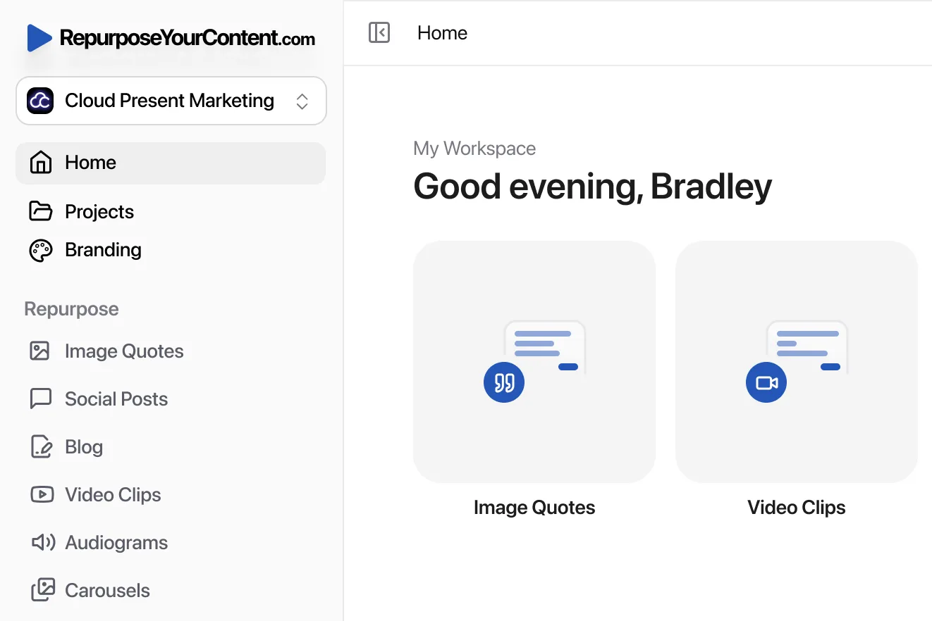
Teams evaluating tooling can review RepurposeYourContent with that lens. The useful question isn’t only “Can this create more content?” It’s “Will this make content output easier to track, compare, and defend?”
What works is atomised, tagged, stage-aware content. What doesn’t work is one large asset with vague reporting and no shared taxonomy.
Building Your Dashboard and Benchmarking Results
A good dashboard should help an executive answer three questions fast.
What did the team spend? What commercial result followed? How confident should anyone be in the attribution?
Only 38% of UK B2B marketers confidently track multi-touch attribution for events like webinars, and inconsistent tagging can lead to 25-40% underreported ROI from long-tail content, according to this UK-focused attribution analysis. That’s why dashboard design matters. Poor structure hides value that already exists.
What the dashboard should include
Keep it compact. Split it into performance indicators and outcome metrics.
Performance indicators by funnel stage:
- Awareness: Traffic, source mix, new visitors, and discovery by content format.
- Consideration: Engaged visits, return visits, webinar interactions, content downloads, and email clicks.
- Decision: Opportunities influenced, pipeline created, progression within active deals, and attributed revenue.
Outcome metrics for leadership:
- Programme ROI: Total attributed return versus total content investment.
- Cost efficiency: Cost per asset, cost per lead, and cost per opportunity influenced.
- Time-to-value: The gap between publication and first commercial result.
- Content velocity ROI: Revenue lift relative to the number of pieces generated from each source asset.
A reporting template that executives will actually read
Use one summary table at the top.
| Metric group | What to report |
|---|---|
| Investment | Total spend by campaign or source asset |
| Output | Number of published assets by format |
| Performance | Traffic and engagement by funnel stage |
| Commercial impact | Leads, pipeline influence, and attributed revenue |
| Payback view | Time-to-value and ROI status |
Then include one short commentary block. Explain what improved, what underperformed, and what will change next month. Don’t flood the slide with screenshots.
Benchmark against yourself first
External benchmarks are useful for context. Internal benchmarks are better for decisions.
Compare:
- Current webinar-derived asset cluster versus previous clusters
- Asset formats against each other
- Cost per piece over time
- Time-to-value by format
- Pipeline influence by source campaign
This creates a reliable optimisation loop. A team can see whether clips are improving first-touch acquisition, whether blogs are producing better assisted conversions, and whether newsletters are helping deals progress.
The best benchmark is a repeated process with cleaner tagging and tighter cost accounting each quarter.
Keep long-tail value visible
Many dashboards fail by overreporting immediate campaign results and underreporting evergreen influence.
Content derived from webinars often keeps working after the launch window. A blog post can rank later. A clip can resurface in a sales sequence. A carousel can support a future campaign. If the attribution window is too short, those outcomes disappear from the report.
A practical dashboard should include a live view and a longer-horizon view. The live view shows current campaign performance. The longer-horizon view shows cumulative influence from evergreen assets.
That’s how content marketing ROI measurement stops being a monthly guessing exercise and becomes a durable operating model.
Stop Guessing and Start Measuring
Content doesn’t need a better defence. It needs a better model.
When business goals are clear, attribution is consistent, costs are honest, and reporting is tied to pipeline, content marketing ROI measurement becomes straightforward. It stops sounding like a marketing argument and starts reading like a commercial report.
Repurposing strengthens that model because one source asset can create a wider set of measurable touchpoints, lower cost per piece, and give leadership a clearer view of what influenced revenue. For teams that want another practical perspective on the broader discipline, this guide on how to measure marketing ROI is worth reviewing alongside an internal reporting framework.
If the goal is to turn every webinar into a measurable content engine, try RepurposeYourContent. It helps teams create video clips, blog posts, social posts, audiograms, image quotes, newsletters, LinkedIn carousels, and timestamps from one recording, then track the business case with far less manual effort.
Tags: