10 Webinar Landing Page Best Practices for High Conversions
Stop losing leads. Apply these 10 webinar landing page best practices to create registration pages that convert. Actionable tips for B2B marketers.

Your last webinar landing page got 1,000 visitors. Only 150 registered. That’s a huge 85% drop-off. For every 100 people interested enough to click your ad, 85 decided your event wasn't worth their time. This isn't a traffic problem. It's a conversion problem. A high-performing page is the most critical factor for your webinar's ROI.
This guide provides an actionable list of webinar landing page best practices for busy B2B marketers. You will learn the exact elements that turn a visitor's interest into a confirmed registration. These are specific instructions for optimizing every component of your page. You will learn how to write a headline that converts and design a friction-free registration form. We will also cover social proof, speaker bios, and mobile-first design. Following these steps helps you build pages that consistently turn visitors into attendees.
1. Nail the Headline: State the Outcome Above the Fold
Most visitors decide to stay or leave in under three seconds. Your headline is the single most important element. It must immediately answer the visitor’s question: “What’s in it for me?”
A benefit-driven headline communicates value before they scroll. This is a critical practice for creating a high-converting webinar landing page. It establishes immediate relevance. It stops busy B2B marketers by directly addressing a pain point.
For example, don't use a title like “Webinar: Q3 Marketing Trends.” A stronger headline is “The 3-Step Framework to Double Your MQLs in Q3.” The first is forgettable. The second promises a specific, desirable outcome.
Pro Tip: Structure your headline to promise a clear, quantifiable result. Use numbers. State a specific outcome. Or pose a question that speaks to your audience's goals.
Get this right to reduce your bounce rate. Get it wrong, and your webinar won't get the audience it deserves. To see successful implementations, explore these 10 effective webinar landing page examples that showcase powerful, benefit-first headlines.
2. Implement a Multi-Step Form with Progressive Profiling
A long registration form is a conversion killer. Asking for too much information creates friction. It causes prospects to abandon your page. A multi-step form solves this by breaking the process into smaller chunks. This is a key practice for any high-performing webinar landing page.
This approach uses progressive profiling to gather qualification data without overwhelming the user. You start with the essentials. Then ask for more information on the next step. This makes the process feel less demanding and boosts completion rates. For example, HubSpot uses this to gather role-specific data after securing the initial email.

Pro Tip: Keep each step focused and minimal, with a maximum of three fields. Start with just an email address. In step two, ask for a role or company size. This lets you segment your audience for follow-up.
This method respects your visitor's time. It still captures the data your sales team needs. You get the registration first, then enrich the contact profile. This is one of the most effective webinar landing page best practices for balancing lead volume with lead quality.
3. Use Social Proof and Credibility Elements
People trust other people more than they trust marketing copy. Social proof answers the visitor's subconscious question: “Has this worked for others like me?” Placing testimonials, client logos, or attendance statistics builds trust. It reduces the perceived risk of committing an hour to your event.

This is a core webinar landing page best practice because it validates your promise. For instance, a Forrester webinar gains authority by citing attendee satisfaction scores. Demandbase uses Fortune 500 client logos to signal its enterprise expertise. These elements show your webinar delivers real-world results. To foster immediate trust, consider incorporating visual elements such as trust badges.
Pro Tip: Place your strongest, most specific testimonial next to the registration form. Use quantifiable results like, "We generated 47 pieces of content from 1 webinar," instead of generic praise. Always include the person's full name, job title, and company.
Getting social proof right provides the final nudge a hesitant prospect needs. Neglecting it leaves visitors questioning your event's value.
4. Create a Benefit-Driven Agenda
Prospects need to quickly scan and understand the specific value they will gain. A generic list of topics is not enough. You must present a benefit-driven agenda that outlines what attendees will learn. Frame these as outcomes and tangible skills. This practice is crucial for justifying the time investment.

This approach shows what your audience will be able to do. For instance, instead of "An overview of repurposing," use "Master the workflow to turn one webinar into eight content formats." Notice how companies like HubSpot create dedicated "You'll learn" sections. This scannable format gives prospects a clear preview of the value exchange.
Pro Tip: Use action verbs like ‘Master’, ‘Build’, or ‘Scale’ to start each point. Organize your agenda with bullets or icons for scannability. Avoid dense paragraphs.
A well-structured agenda proves you respect the attendee's time. It promises a focused, high-value session. It directly answers the question, "Is this webinar worth my hour?" Making this a core part of your webinar landing page best practices is non-negotiable.
5. Design a Strategic CTA Button
Your call-to-action (CTA) button is the final gateway to registration. Its design, copy, and placement are not minor details. They are decisive factors that influence whether a visitor converts. An ineffective CTA can render all your compelling copy useless.
Optimizing your CTA button is a core webinar landing page best practice. It creates a clear, unmissable path for the user. For a busy professional scanning the page, the button must stand out immediately. It must communicate its purpose with zero ambiguity.
For example, HubSpot uses bright orange CTAs that contrast sharply against its page designs. This colour choice is deliberate. It guides the user’s eye directly to the most important action. A button with copy like ‘Save Your Seat’ is more persuasive than ‘Submit’.
Pro Tip: Use action-oriented, first-person language for your CTA copy. Test phrases like "Reserve My Spot" or "Count Me In" against standard options. Make the button feel like the visitor's own choice.
Getting this right turns passive interest into active registration. Strategic CTA placement ensures that a clear next step is always visible.
6. Build Trust with Speaker Bios and Credibility
Your speakers are the face of your event. Their credibility directly impacts registration rates. A strong speaker bio proves your event is led by a genuine expert. This is a critical webinar landing page best practice because it answers the visitor’s question: “Why should I listen to this person?”
A weak bio lists job titles. A strong one highlights specific, relevant achievements. For example, instead of “John Smith, VP of Marketing,” use “John Smith, who grew his company’s pipeline by 300% using this exact framework.” Show, don't just tell.
A real-world workflow to write a strong bio:
- Identify the Core Promise: What is the main outcome of the webinar? (e.g., doubling MQLs).
- Connect Speaker to Promise: Find a specific achievement that proves the speaker can deliver on that promise. (e.g., "Jane grew her last company's MQLs from 500 to 1,500/month").
- Add Social Proof: Mention a notable company they worked for, a well-known publication they wrote for, or a major conference where they spoke.
Pro Tip: Include a high-quality, professional headshot. Add links to their LinkedIn profile or a relevant article they wrote. This allows prospects to verify their expertise.
Using a short video of the speaker is even more powerful. It adds a human layer that text cannot match. You can see how platforms like Wistia analyse video engagement metrics to drive conversions.
7. Optimize for Mobile with Touch-Friendly Elements
Over half of B2B webinar registrations happen on mobile devices. A clunky mobile experience kills revenue. Your landing page must be fully responsive. It must offer a seamless experience on a small screen. This is a fundamental webinar landing page best practice because a slow or difficult page causes immediate drop-off.
A mobile-optimized page loads quickly. It stacks content vertically in a single column. It features large, touch-friendly buttons and form fields. For instance, brands like HubSpot build their pages with a mobile-first philosophy. This ensures they pass Google’s Core Web Vitals and load in under two seconds.
Pro Tip: Test your page on actual mobile devices over a 3G network, not a desktop emulator. This reveals real-world performance bottlenecks. Compress all images aggressively with a tool like TinyPNG.
Failing to optimize for mobile means you are turning away at least 50% of your potential audience. After securing mobile registrations, plan how you will repurpose video content for social media, creating mobile-friendly clips to re-engage your audience.
8. Use Authentic Urgency Elements
A sense of urgency prompts action. Without it, many potential attendees will bookmark your page for "later" and never return. Countdown timers, limited seat notices, and early-bird bonuses create a reason to register now.
This tactic maximizes registrations from your existing traffic. For B2B audiences, authenticity is critical. Fabricated scarcity damages your brand's credibility. Tie urgency to real constraints, like the start time of a live event or a genuine bonus with a firm deadline.
For instance, Gartner often incentivizes early sign-ups with an exclusive research report for those who "Register by Friday". This creates real, value-driven urgency. A timer counting down to a live Q&A session is an authentic constraint that motivates immediate sign-ups.
Pro Tip: Your urgency must be honest. Never use "only 10 spots left" if your webinar capacity is 500. Instead, offer a real bonus, like a checklist or template, for a limited time. For recurring webinars, a "Next session starts in..." timer is effective and truthful.
Getting this balance right turns passive interest into active registration. It’s a simple but effective part of building high-performing webinar landing page best practices.
9. Create A/B Testing Priorities
You don't have time to test everything. You need to focus on what moves the needle. A prioritized A/B testing plan is a key practice for optimizing your webinar landing page without wasting resources. Focus on high-impact elements first.
Start with the most influential components of your page. Your testing priority should be:
- Headline: Test a benefit-driven headline vs. a question-based one. Example: "Double Your MQLs" vs. "Are You Making These MQL Mistakes?"
- CTA Copy: Test first-person vs. third-person copy. Example: "Reserve My Spot" vs. "Reserve Your Spot."
- Form Length: Test a single-step form vs. a multi-step form. Measure completion rates at each stage.
An example of a strong landing page structure is Drift's. They feature a bold headline, a clear sub-headline, a prominent speaker photo with credentials, and a simple registration form all above the fold. Another example is Gong, which uses customer logos and a specific, data-backed headline to build instant credibility. A third is Animalz, which uses a minimalist design with a hyper-specific agenda to attract a sophisticated audience.
Pro Tip: Run one test at a time to get clean data. Let each test run long enough to achieve statistical significance, usually at least 100 conversions per variant.
This targeted approach provides clear insights into what motivates your audience. It turns guesswork into a repeatable process for increasing registrations.
10. Maximize ROI with a Post-Webinar Strategy
A great landing page gets you registrations. But your job isn't done. The real ROI comes from what you do after the webinar ends. A smart post-webinar strategy maximizes the value of every dollar you spent on acquisition.
Tying your landing page to your post-webinar content plan is a crucial best practice. It frames the webinar not as a one-off event, but as the start of a content engine. A great landing page gets people in the door. Repurposing the webinar content maximizes the value of every single attendee. It turns one hour of effort into months of marketing assets.
This transparency on the landing page itself can boost sign-ups. Mentioning that attendees will receive the recording, slides, and a summary blog post increases the perceived value of registering. It shows you have a plan to deliver ongoing value.
Pro Tip: Clearly state on the landing page what registrants will receive. Use phrases like “You’ll get the recording, slides, and a full summary within 24 hours.” This creates anticipation and demonstrates your commitment.
Detailing the full content ecosystem boosts initial sign-ups and improves long-term engagement. For more ideas on extending this value, learn about the best ways to repurpose webinar recordings.
How RepurposeYourContent Helps
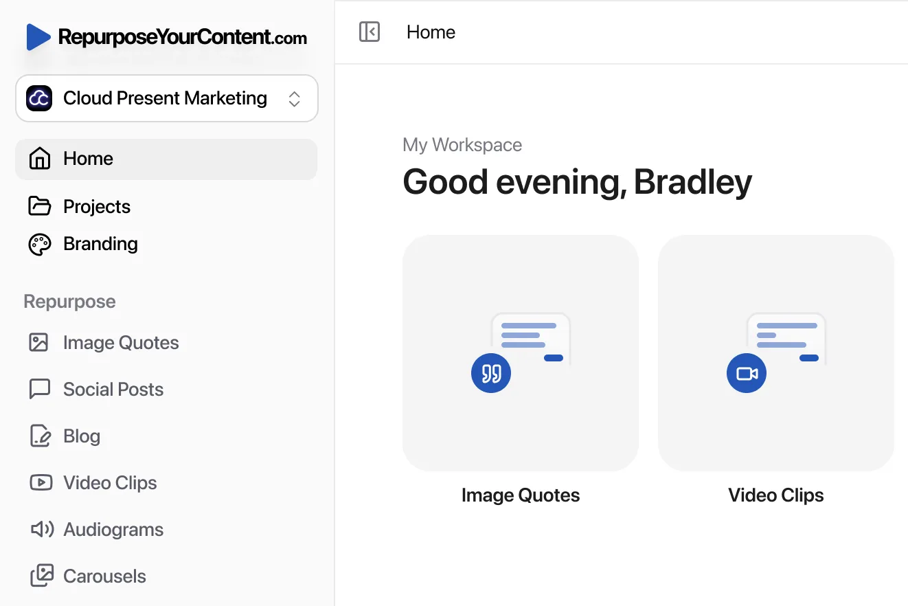
A great landing page gets you registrations. RepurposeYourContent helps you maximize the ROI of those registrations. Our platform automatically turns your one-hour webinar recording into a complete content campaign.
Instead of your webinar content dying after the live event, it becomes the source for:
- Shareable video clips for social media
- SEO-optimized blog posts with timestamps
- Engaging LinkedIn carousels
- Audiograms for podcast feeds
- Branded image quotes
- Ready-to-send newsletters
Your high-converting landing page delivers the audience. Our intelligent repurposing workflow multiplies the impact of that audience. This creates a sustainable engine for demand generation.
Ready to turn your next webinar into a month of high-performing content? Try RepurposeYourContent today.
Tags: